
Colour Coordination
During the 1920s, advice columnists encouraged women to brighten up their homes using the bolder colours that were becoming more fashionable. However, as these writers frequently noted, many women found it difficult to select and coordinate these brighter shades.
The average home has the same difficulty that the average individual has, in at least one particular—the home and individual both far too frequently lack color. And lacking color, they lack charm and graciousness and beauty as well. The color that you introduce into your home is as definitely a part of the personality of the home as the color of an individual, whether that color is happiness, charm, gaiety or beauty of soul.
Most people are afraid of color in the home. They hear, mysteriously, of color schemes, but they do not know what color schemes mean. They hear of colours that blend or complement each other, and that seems even more mysterious. The result is that because they are afraid to introduce brilliancy into their homes because they might make a mistake, they put instead, drab things together and it is not surprising when the whole effect becomes most uninteresting and dull.(Gooson, 1926, p. 24)
The problems that women experienced when selecting decorating colours also applied to buying ready-to-wear clothing. When selecting clothing colours, a large number of variables had to be taking into account including the age, size, and height of the person, and the time of day and occasion in which the clothes were to be worn. Clothing shades also needed to harmonised with the colour of a woman’s complexion, hair and/or eyes.
To give individual value to a woman’s complexion and figure, to her natural style and type of feminine charm, color harmony and logical design in dress are the first essentials. Every woman should know which colors and which lines are most becoming to her and, vice versa, which she should avoid.
Colors influence the appearance of the eyes, hair, and complexion. Those colors which harmonize with the complexion tints improve them. Those colors which disagree with the hues of the skin, eyes, and hair, are responsible for a corresponding loss of beauty. Colors influence costume effect. Inharmonious colors associated in dress hurt the eye and make for harshness and vulgarity.(Melrose, 1922, p.5)
To help with this, fashion writers put often women into broad colour groups, usually based on based on hair colour and complexion, and then listed suitable colours for each ‘type’.
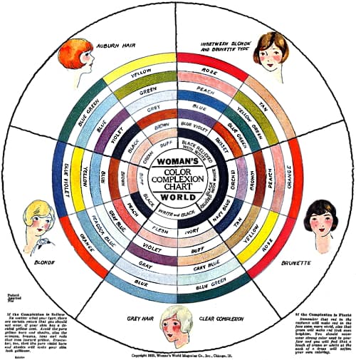
Above: 1925 Colour Complexion Chart from Woman’s World with fabric colour suggestions.
Colors, as well as people, can also be thought to have ‘personality’. Lighter, paler colours can be considered feminine and dainty, intense colors aggressive, brighter colours outgoing, and deep colors dignified. The expectation that clothing should also reflect a woman’s personality or individual style meant that colour selection took personality into account. The types used by fashion writers were therefore sometimes overlaid with broad character traits such as ‘sporty’, ‘romantic’ or ‘sophisticated’. These personality types could be demonstrated using movie stars as examples, a process made easier by the fact that many movie stars were type cast so had a stock ‘personality’ to go with their colouring.
Make-up
Early beauty advice on selecting make-up shades followed the path laid down by the fashion industry. Make-up was to be used to enhance, not overpower, a woman’s natural colouring and facial features, with shades selected to complement the colour of her complexion, hair and/or eyes.
The object of rouge and lipstick is, not to change the natural color, but to increase it without altering its tone. Thus if you have a red-violet coloring, a vivid orange rouge will not only fairly shriek its presence but will give you a harsh, hard look and usually clash with the color of your hair and eyes.
Powder should always match the natural background of the skin, which may be found on the neck and forehead. Remember that powder is not designed to change the natural color, but to give a soft velvety finish and to remove shine and other imperfections.(Hempstead, 1929, p. 43)
Like their fashion counterparts, beauty experts and cosmetic companies also used types to demonstrate the process of shade selection and these types sometimes included character or personality traits. If they had access to them, movie stars were also used as examples.
See also: Make-up, Personality and Types
1920s
In the early 1920s, harmonising powder, rouge or lipstick with a woman’s natural colouring was not without problems. Many women found it difficult to match their colouring to one of the given types and the limited range of make-up shades generally favoured lighter complexions. This partly explains the porcelain appearance of many celebrities like Clara Bow, Billie Dove, Anita Loos and Louise Brooks.
Shade ranges widened during the 1920s as the practice of sunbathing became fashionable and companies added deeper tones better suited to suntanned skin. However, as this example from Elizabeth Arden in 1928 shows, available colours were still very restricted
Venetian Flower Powder: Shades: White, Cream, Maréchal Neil, Naturelle, Rose, Special Rachel, and Spanish Rachel.
Poudre d’Illusion: Shades: Illusion shade, Rachel, Mat Fonce, Ocre, White, Minerva, Banana and Poudre de Lilas.
Venetian Rouge Amoretta: Shades: Light, Medium, Dark, and American Beauty.
Venetian Lip Paste: Shades: Star, and Carnival.
Venetian Arden Lip Stick (original): Shades: Light, and Dark.
Venetian Arden Lip Stick: Shades: Bright, Medium, and Maroon.
Venetian Indelible Lip Pencil: Shades: Dark, and Light.
An Indelible Lip salve: Shades: Light, and Dark.
Venetian Eyelash Cosmetique: Shades: Brown, Dark Brown, Black.
Arden Liquid Cosmetique: Shades: Dark Brown, Brown, and Black.
Venetian Eyebrow Pencil: Shades: Black, Dark Brown, Brown, and Blue.
Venetian Eye Sha-do: Shades: Blue, Medium, Dark Blue, Dark Brown, Light Brown, Gray Brown, Black, and Violet.
(Elizabeth Arden, 1928)
In the same way that women were recommended to harmonise the colour of their dress, shoes, hats and other accessories, women were counselled to colour coordinate their powder, rouge and lipstick, something that was later extended to nail polish as well
A visitor to France states that the Parisienne today is careful to have her lip-stick, rouge and powder exactly to tone. If she be a brunette (despite the temporary preference for blondes) she will have a more orange touch to her lip-stick and a darker shade to her powder and rouge. The great secret is that they must have the same tone shade.
(The American perfumer & essential oil review, 1926, October)
Nail polish
Women who took up suntanning noticed that their darker skin suited more vibrant colours and began to replace their pale or pink-coloured nail polish with something brighter and more obvious. This, in turn, led to the vogue for matching nail polish with clothing and soon more outlandish colours, such as blue, green and purple, became popular with the fashionable elites, both on the beach and elsewhere.
For some months Mayfair has been discussing it. Was it really true that smart Paris women were having their finger-nails coloured to match their gowns, that in Biarritz not only red finger-nails, but gold and purple and rainbow tinted ones, were seen every evening? And even so, would people like it over here, or would they think it outré?
Now it has passed the stage of discussion; it is a definite fashion. You may take it or leave it as you like; for there are definitely two camps over the question. Many smart women declare emphatically against it; many more, equally smart, demand it with every manicure.
Those who do, go round to Hanover Square and ask Francis, who has a range of twelve shades, to match their finger tips to their evening gowns.(British Harper’s Bazaar, 1930)
If a brightly coloured red nail polish was applied then coordinating it with clothing and lipstick also became fashionable.
Red can look most seductive if it completes a colour scheme of lips and beads, or lips and a red frock. Here great care is necessary. If the nail lacquer does not exactly match the lipstick the result is a disaster. Let us be soigneé in our daring details or else eschew them altogether.
(British Harper’s Bazaar, 1930)
Compared with other forms of make-up, nail polish did well during the depression and, as the use of reds increased, the older transparent polishes gave way to cream or opaque types which added even more colour to the nail plate.
See also: Nail Polishes
Through the 1930s, nail polish companies pushed the idea that polish should match clothing as it encouraged women to buy different shades of polish for different outfits, thereby increasing sales. Then, when firms like Cutex and Revlon added lipsticks to their range, they promoted the fashion of matching lipsticks with nail polishes so that women would purchase two matching items.
See also: Cutex (Notham Warren) and Revlon
As sales of red nail polish grew, coordinating lipstick and polish became so widespread that many cosmetic companies without a nail polish in their range – such as Charles of the Ritz, Richard Hudnut and Dorothy Gray – added one to maintain sales of their lipsticks.
1930s
As with other commodities, the sale of most cosmetics fell during the early years of the Great Depression and many beauty firms increased their shade ranges to make their make-up lines more competitive.
Like the development of skin-care routines – which recommended that women to use more than one item to get the full benefit – cosmetic companies endorsed the idea that make-up colours should be colour coordinated as it encouraged women to buy their lipstick, rouge, face powder and nail polish from the same source.
When you choose your make-up select it with an eye toward your ensemble, just as you do with your costume. Every smart woman knows that it is not enough for each hat, bag, dress, shoe to be chic. They must be combined in a harmonious ensemble.
Yet so few of us realize that make-up should have the same careful color-scheming. In a word you must ensemble your make-up as well as your costumes. Then only will you be seen in your best light, your eyes colorful and starry; your cheeks gay with a youthful blush; your lips a warm, inviting accent.(Harriet Hubbard Ayer, c.1938)
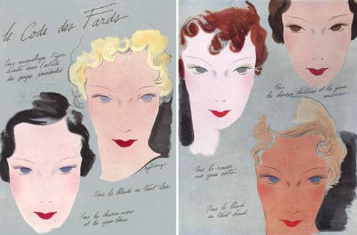
Above: 1934 Le Code des Fards. Coordinated make-up shades suggested for different beauty types.
Naturally, women who wanted to combine make-up from different brands got very little help from cosmetic companies on the best way to do this. Magazines sometimes came to the rescue here, providing information about equivalent colours across a range of brands.
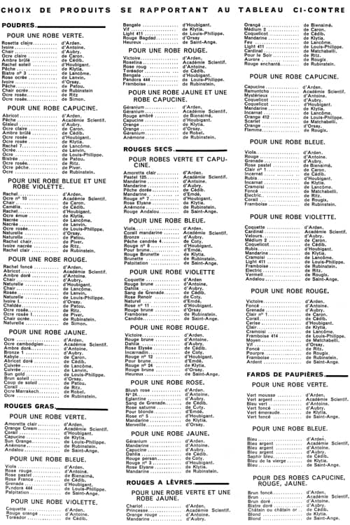
Above: 1935 Chart from the French magazine ‘Votre Beauté’ listing colours from a range of cosmetic companies that go well with different fabric shades.
As make-up shade ranges increased during the 1930s, providing clear and concise information on how to coordinate powder, rouge, lipstick and other forms of make-up became an important marketing tool. Unfortunately, cosmetic companies increasingly adopted another idea used by fashion designers and began giving their new make-up shades dramatic rather than descriptive names. This meant that recognisable shade names such as light, medium and dark, or geranium, crimson, cherry and raspberry, were replaced with names that captured more attention but had no generally agreed meaning.
Shade charts
Colour cards could be used to give customers an idea of the shade ranges a company produced but they did not explain how the colours were to be combined.
See also: Colour Cards
Colour wheels and colour fans were used by some companies to explain how to coordinate shades in a range but the simplest and cheapest way was to produce a shade chart which listed different make-up items – rouge, powder, lipstick etc. – against set beauty types. Once a woman had identified her type she could then select the best make-up shades for her particular colouring. The charts varied, depending on the beauty types the company used, the make-up items included in the chart, and the number of shades in production.
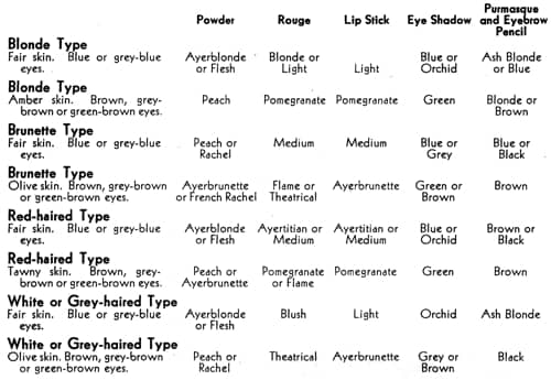
Above: 1934 Harriet Hubbard Ayer shade chart.
The charts could be simplified by using common shade names for similarly toned and coordinated lipsticks, rouges and nail polishes, a practice that was widely but not universally adopted.
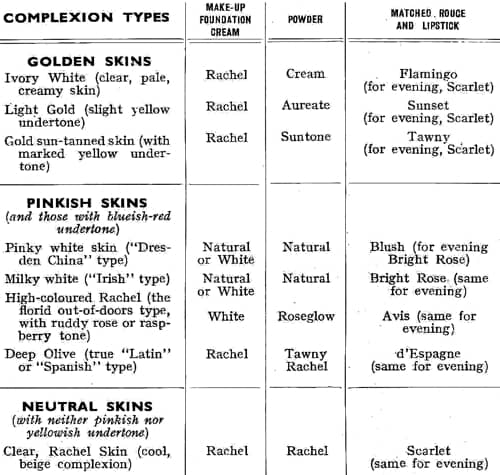
Above: 1939 Dorothy Gray shade chart with lipsticks and rouge using the same shade names.
Fashion and make-up
Generally speaking, company shade charts aligned make-up shades with beauty types with most making little or no reference to fashion colours. However, this did not mean that cosmetic companies did not take fashion into account.
Unlike clothing fashion colours, that changed from season to season and year to year, lipsticks, rouges, face powders and nail polishes were sold in the same shades over long periods of time. Although limited, the colour ranges available in the 1920s and 1930s generally included vivid colours for evening wear and enough shades to enable women to make some allowances for different outfits and/or accessories like brightly-coloured jewellery.
In applying rouge, powder, lip stick and eyebrow pencil be sure to place your mirror so that the light falls squarely upon your face. Be sure, too, that it is the kind of light—sunlight or electricity—in which you are later to appear. This is very important because light influences color and controls effect. A shade of rouge that is distinctly “off” for daytime use may be entirely right and charming in the evening. The same thing is true of powder.
The safest way to proceed is this: first be sure that your light is right, then place near you the gown you have decided to wear, and then experiment until you have achieved exactly the right effect.(Richard Hudnut, 1927, pp. 28-29)
In the 1930s, recognising that make-up, like hair dyes, could change a woman’s ‘natural’ colouring, Elizabeth Arden and others went further, suggesting that make-up could enable women to wear a greater range of fashionable colours than her natural colouring might otherwise suggest.
ELIZABETH ARDEN proves that, with the clever use of her Assets to Beauty, you can style your face to harmonize with the new colors, and be charming in all of them.
WITH WHITE—a slightly darker shade of your powder foundation … a richer shade for your rouge … Poudre d’Illusion in Banana or Rachel … and a very vivid lipstick, possibly the new “Chariot.”
WITH SKIPPER BLUE—which has a tendency to throw deep shadows up into the face—a clever eye make-up is necessary. Wear a light make-up … a light shade of rouge … powder with a dash of pink in it, and a bright lipstick. Your Eye-Shado should repeat the blue of the dress. For eyes that are blue try finishing the lashes with light blue Cosmetique tipped with black.(Elizabeth Arden advertisement, 1931)
Make-up used in this way coordinated make-up colours with seasonal and yearly changes of fashion. Elizabeth Arden and others published annual Colour Charts which matched their make-up with current fashion colours and added new shades where needed.
See also: Elizabeth Arden (1930-1945)
In the late 1930s, Charles Revson followed this approach but took it even further. He treated Revlon nail enamels as fashion items rather than fashion followers, introduced new nail shades each spring and autumn, and then coordinated these with Revlon lipsticks and rouges when they were introduced in 1939 and 1940 respectively.
See also: Revlon
This built on an idea already used in the fashion and other consumer product industries which used colour to make items redundant long before they were worn out. Women began buying new make-up items on a regular basis simply because of a change in colour, thereby increasing sales. Other large cosmetic companies followed suit and were soon introducing new shades on a seasonal basis.
Although Revlon kept an eye on colour forecasts, its make-up was not overly coordinated with them, nor did its shades specifically target beauty types; the suggestion being that they were suitable for everyone.
Other cosmetic companies made specific references to both. For example, in 1945, Helena Rubinstein introduced her Color-Spectrograph system which combined fashion, complexion and personality. It provided make-up and fashion colour suggestions for four beauty types – Blonde, Medium-Brown, Redheads, Brunette and Silver-Grey – with coordinated colours supplied for Self-Harmony, Complementary, Dramatic and Subtle looks.
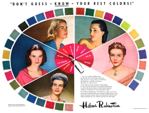
Above: 1945 Helena Rubinstein Color-Spectrograph.
Some later developments
Leaving to one side the increased used of hair dyes in the 1950s – which could affect a woman’s overall colouring – two developments in make-up in the 1950s and 1960s should be mentioned: the introduction of new types of foundation and the growth of eye make-up.
Foundations: After the war, new forms of make-up gradually replaced the use of face powder. By the 1970s, these came in shades that could be matched to most complexions to give a more natural-looking film of colour on the face. The wide range of formulations – compact, cream, stick, and liquid – also meant that most women could find a foundation that matched their complexion. When used to produce a ‘natural look’ this removed many sources of make-up colour clashes.
Eye make-up: Through the 1960s, make-up placed more emphasis on the eyes than the lips. Eye make-up was often highly coloured and the result could be gaudy. Although some women embraced this, others stayed with black and brown mascara, eyeliner and eyebrow pencil. This emphasised the eyes but as the colours were blacks and browns this avoided colour-coordination problems with other forms of make-up, their hair, skin and eyes, and colour clashes with clothing or accessories; a solution many women still adopt today.
First Posted: 26th October 2016
Last Update: 10th December 2020
Sources
Allen, E. (Ed.). (1961). The book of beauty. London: George Newnes Ltd.
The American perfumer & essential oil review. (1906-1955). New York: Robbins Perfumer Co. [etc.].
Buttrick, H. G. (1924). Principles of clothing selection. New York: The Macmillan Company.
Beaton, C. (1954). The glass of fashion. London: Weidenfeld and Nicolson.
Blaszczyk, R. L. (2012). The color revolution. Cambridge, MA: MIT Press.
Elizabeth Arden. (1928). The quest of the beautiful. [Booklet]. USA: Author.
Goosen, S. (1926). Have you enough color in your home? Motion Picture Magazine. October, 34-35.
Harriet Hubbard Ayer. (c.1938). Make-up patterns [Booklet]. USA: Author.
Hempstead, L. (1929). What are your correct colors? Photoplay. February, 42-43, 81, 106.
Melrose, M. (1922). Color harmony and design in dress. New York: Social Mentor Publications.
Richard Hudnut. (1927). The way to a lovely skin [Booklet]. USA: Author.
Stephens, N. E. (1928). Color and design: For the woman who would look her best. New York: North American Society of Arts.
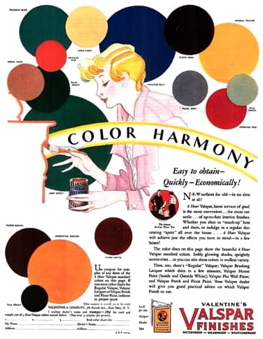
1929 Valentine’s Valspar Finishes.
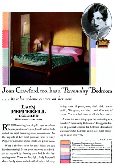
1929 Pepperell Manufacturing Company using colour to personalise a bedroom. Introduced in 1928, customers could use the company booklet ‘Personality Bedrooms’ to harmonise Lady Pepperell sheets and pillowcases with their complexion.
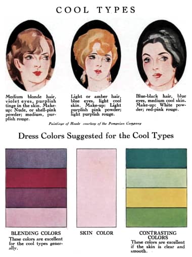
1928 Blending and contrasting dress colours suggested for cool types (Stephens, 1928).
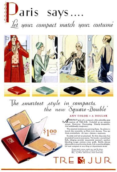
1929 Tre-Jur compacts in colours coordinated with clothing.
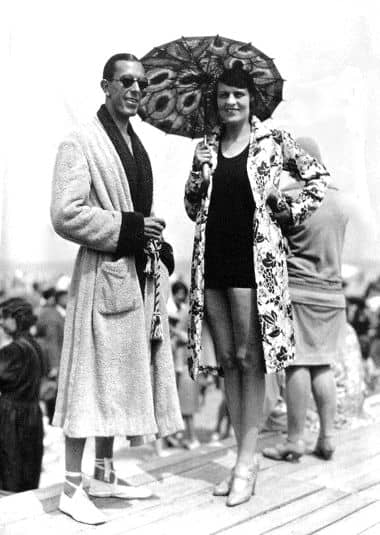
1929 The couturier Jean Patou [1887-1936] in Deauville, sporting a well-developed tan, with Madame Jane Dubonnet, née Donaldson. Brightly coloured clothing and accessories looked good against a tanned skin.
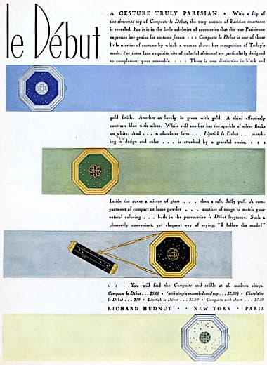
1929 Richard Hudnut Le Debut Compacts to match an ensemble.
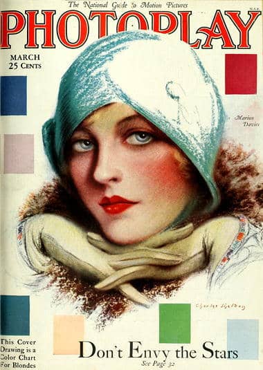
1929 Photoplay cover with colours for blondes.
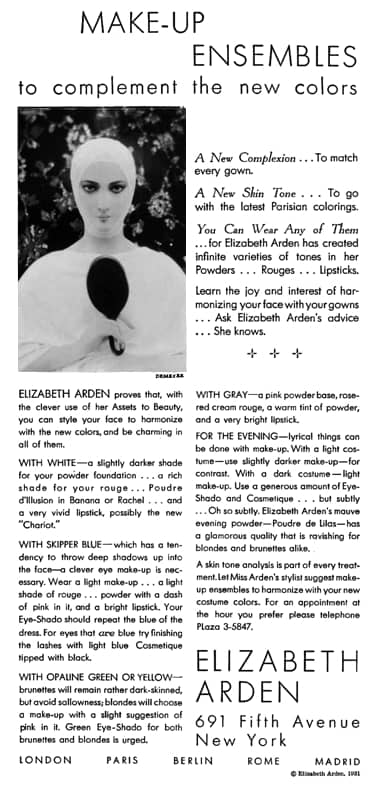
1931 Elizabeth Arden Make-up Ensembles.
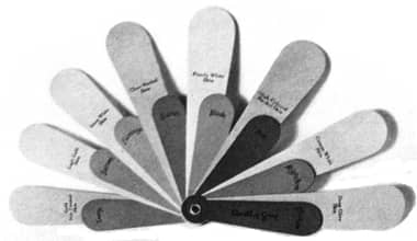
1933 Dorothy Gray Color Fan as used on make-up counters. Each of the eight fan panels corresponds to one skin-type and is accompanied by a smaller panel showing the correct shade of rouge and lipstick. Matching lipsticks and rouge were given the same name, e.g., Tawny, Flamingo, to make things easier. The correct skin tone of the client could be determined placing the fan against the throat. Then the rouge and lipstick indicated by the nearest panel on the fan suggested the perfect Dorothy Gray make-up for that skin type.
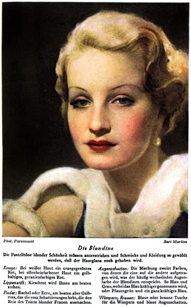
1933 The actress Sari Maritza [1910-1987] being used to demonstrate the make-up suitable for a blonde type (Germany).
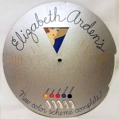
Arden Color Wheel based on the premise that ‘Any woman can wear any color’. By turning the wheel until it showed the colour of the dress in the triangle at the top, a woman could determine the shade of Arden powder, rouge, lipstick, eyeshadow and mascara she should wear with that dress.
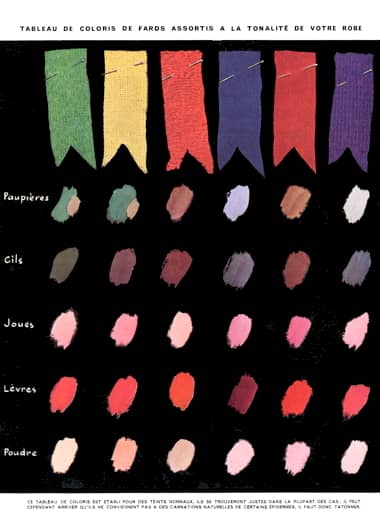
1935 Votre Beauté magazine make-up shade suggestions for different fabric colours for Paupières (Eyelids), Cils (Eyelashes), Joules (Cheeks), Lèvres (Lips) and Poudre (Powder).
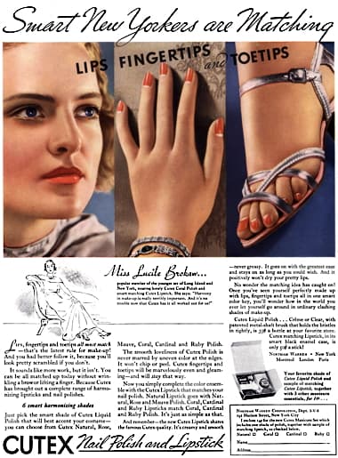
1935 Cutex matching lipstick and nail polish.
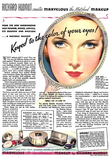
1936 Richard Hudnut Marvelous Make Up “Keyed to the color of your eyes”.
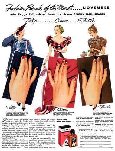
1937 Cutex polish colour coordinated with clothing.
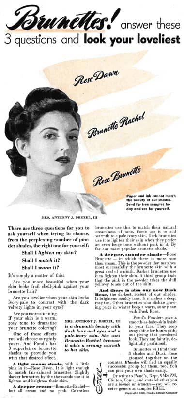
1940 Pond’s tonal adjustments for brunettes.
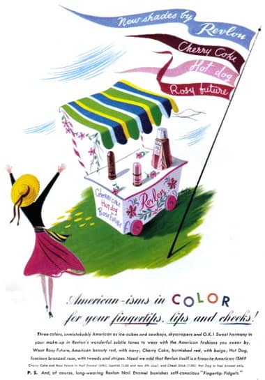
1941 New shades by Revlon, a form of planned obsolescence.
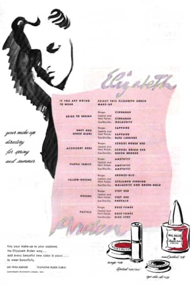
1941 Elizabeth Arden coordinating make-up with fashion colours.
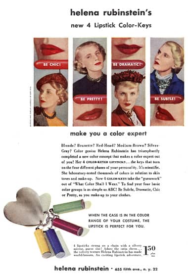
1948 Helena Rubinstein Color-Keyed Lipsticks.
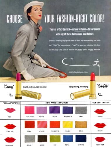
1951 Coty fashion colours for Creamy and Sub Deb lipsticks.
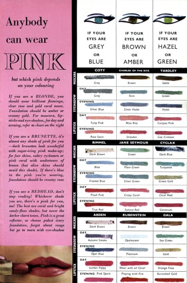
1961 Anybody can wear pink (Allen, 1961).
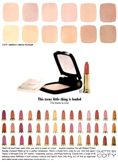
1964 Coty Air Spun Cream Powders and Lipsticks in a wide variety of coordinated shades.